MacroMeal
Dwight Clarke

Project Overview
The Product:
MacroMeal aims to deliver Calorie and Macro-Friendly food to busy individuals.
Project duration:
1 Month
My role:
UX designer, UX researcher
Responsibilities:
User research, Wireframing, Mockups, Prototyping, User Testing
The problem:
Busy workers and social people who don’t have time for preparing meals. Have difficulty finding takeout that fit their macros.
What are Macros?
“Macros” are short for macronutrients. They’re the three categories of nutrients you eat the most and provide you with most of your energy: protein, carbohydrates and fats.
So when you’re counting your macros, you’re counting the grams of proteins, carbs or fat that you’re consuming.
The Goal:
Design an app that will help people order healthy macro-friendly food easily and quickly.
Why count Macros?
Keeping track of your macros can help you make (or plan to make) smart, healthy food choices. It’s similar to counting calories or points however, it helps you understand where those calories are coming from and how they affect your body.
It also helps you understand that not all calories are created equal.
Understanding
the User
User Research Summary
I conducted interviews and created empathy maps to better understand the potential users.
The primary groups I identified were:
Group 1: College students who are looking for healthy Dinner options
Group 2: Young professionals looking for meals they are craving that fit their macros.
Pain Points
1
Busy individuals don’t have time for preparing meals.
2
Platforms for ordering food don’t have calorie or macronutrient information
3
Difficult to compare the same meal from different restaurants.
User Persona: Alex

Age: 21
Education: Pursuing Bachelor’s
Hometown: Long Island, NY
Family: Single, no children
Occupation: Student, intern
“I am always working or studying so I don’t have time to cook, but I still want to eat healthy”
Goals:
To have time to focus on studies and her internship
To have readily available tasty healthy dinner options
Frustrations:
No time for cooking or preparing meals.
Difficult and time consuming figuring out takeout that fits her macros
Problem statement:
Alex is a busy university student doing an internship in a big company, who needs easy access to healthy food ordering options because she has no time to cook meals for herself.
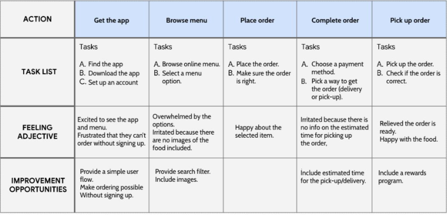
User Journey Map
Starting the
Design
Usability Study Findings
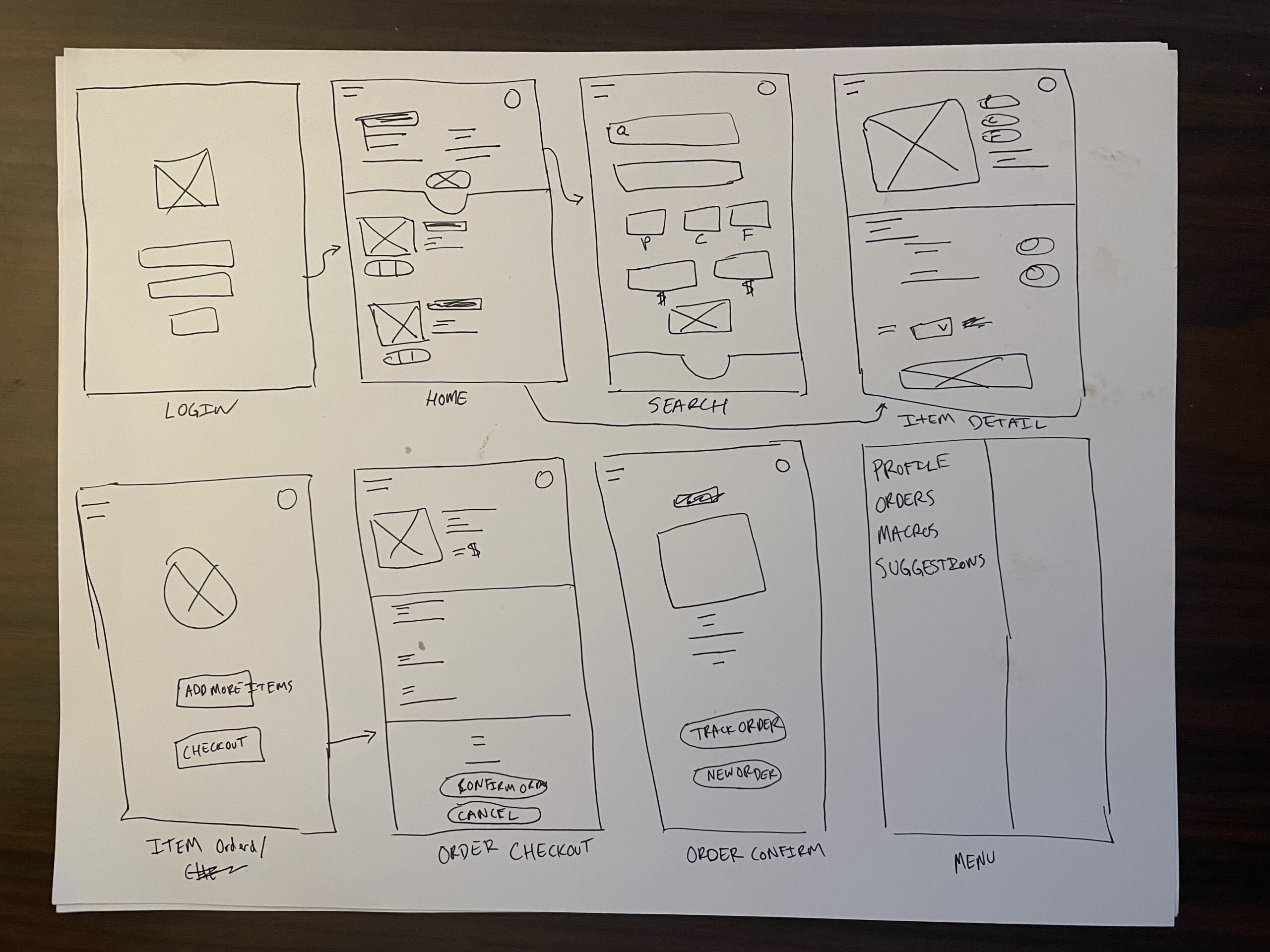
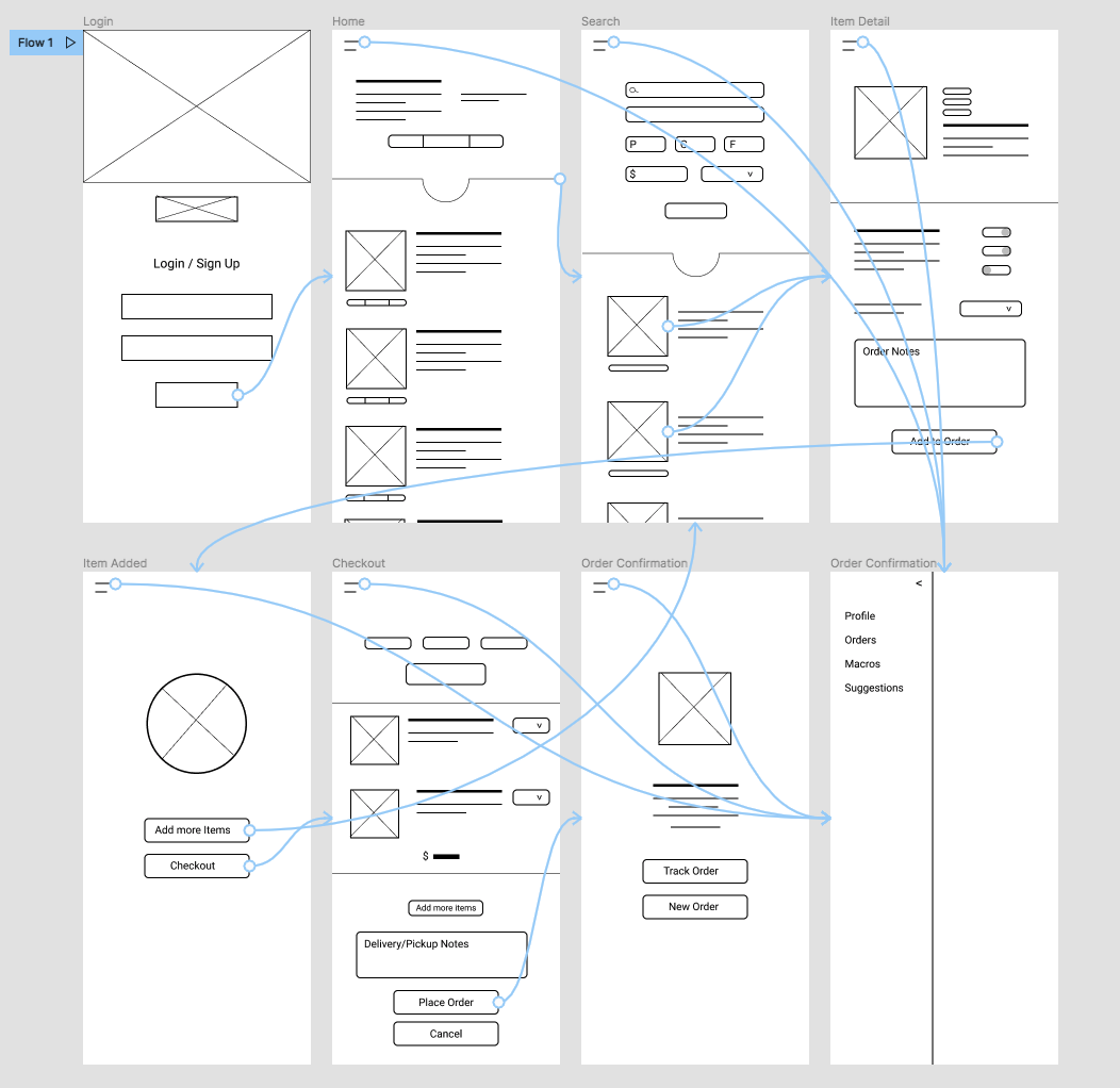
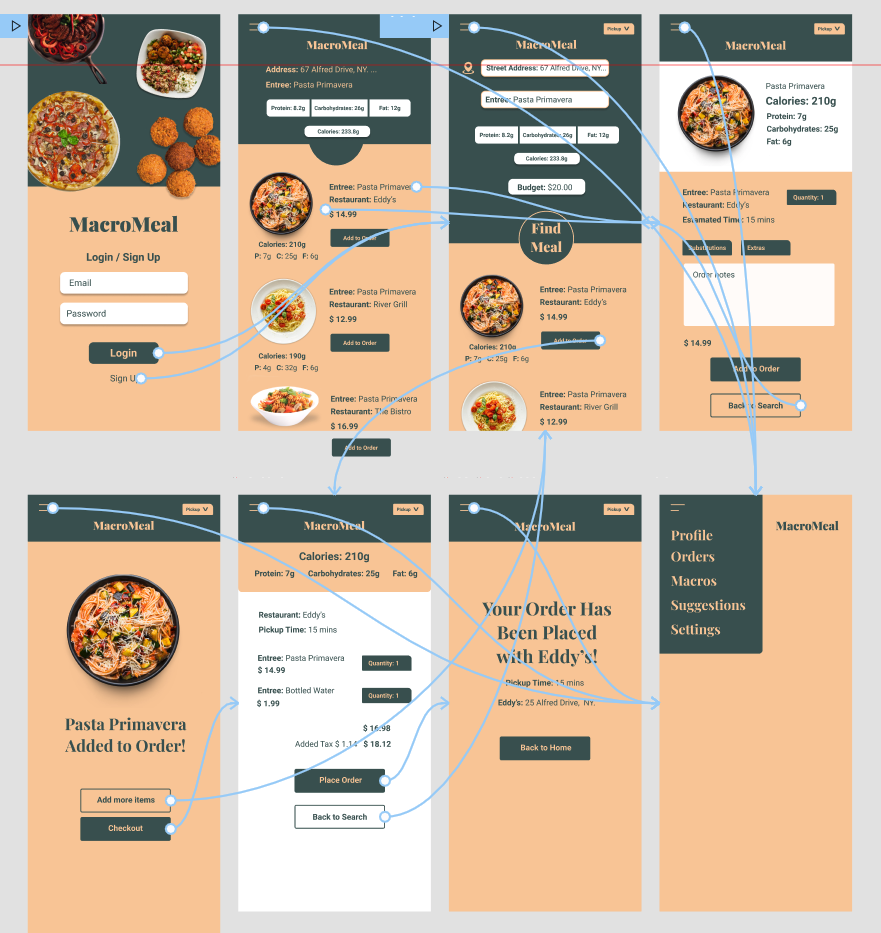
I conducted two rounds of usability studies. Findings from the first study helped guide the designs from wireframes to mockups. The second study used a high-fidelity prototype and revealed what aspects of the mockups needed refining.
Round 1 findings
1 Users want better menu organization
2 Users want a more intuitive process of signing up
Round 2 findings
1 Making customized orders is confusing.
2 Users want a quantity option when ordering
3 Prefer all items listed at checkout instead of scrolling through items
High Fidelity Mockups
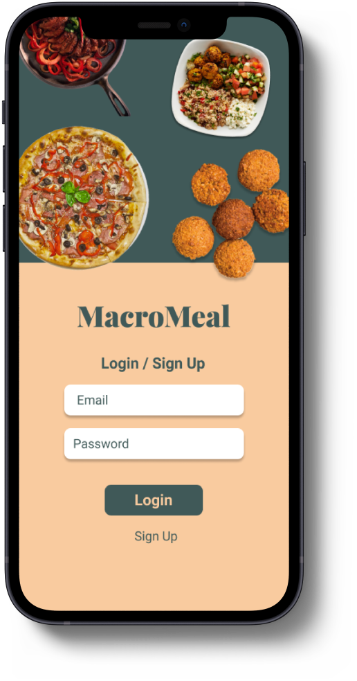
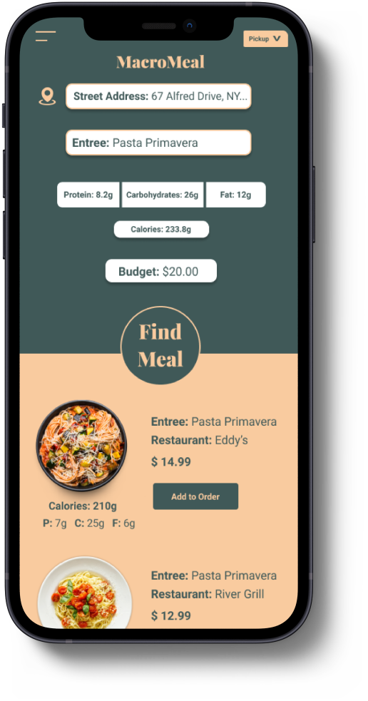
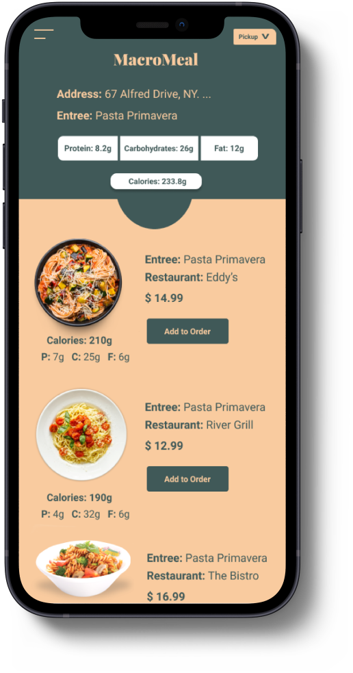
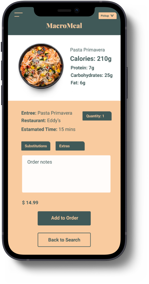
The usability study showed the frustration users faced with the first low-fi version when it came to menu browsing. Filter and search options were included to help users pick the food they want.

High Fidelity Prototype
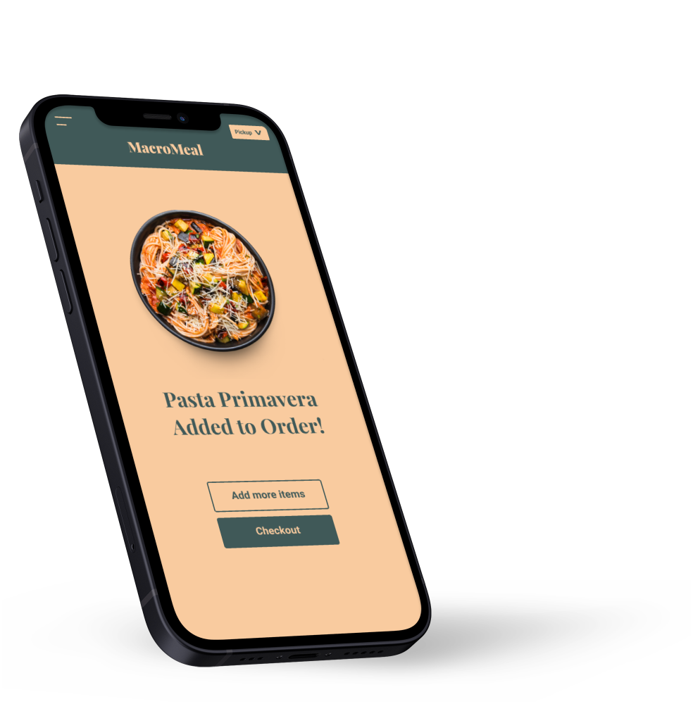
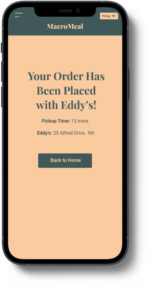
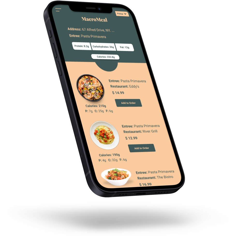
The final high-fidelity prototype presented cleaner user flows for making a customized order, and better in-app organization, especially menu organization.
Click Here for the Prototype
Going Forward
● Next Steps
● Closing
Next Steps
● Conduct more user research to determine any new areas of need.
● Conduct another round of usability studies to validate whether the pain points users experience have been effectively addressed.
Thank You
Thank you for reviewing my work! If you like to see more or get in touch please don’t hesitate to contact me.
Email: Dwightc93@Gmail.com
Portfolio Site: DwightSClarke.com
Linkedin.com/in/dwightc93

